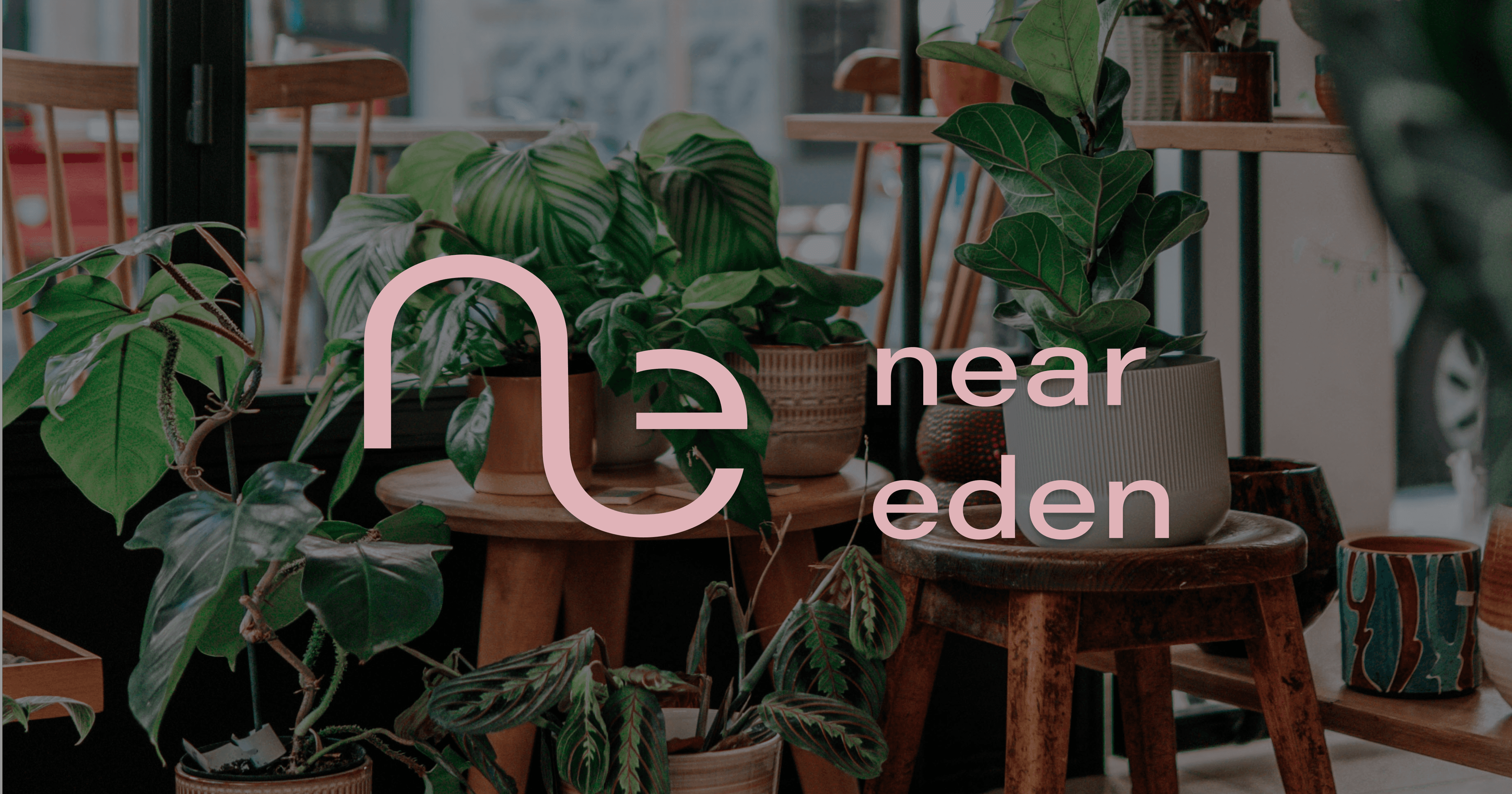
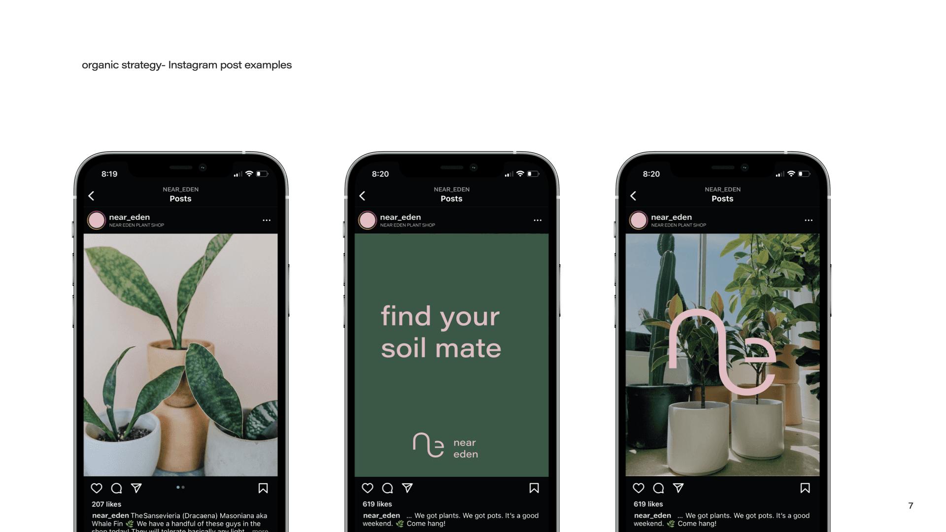
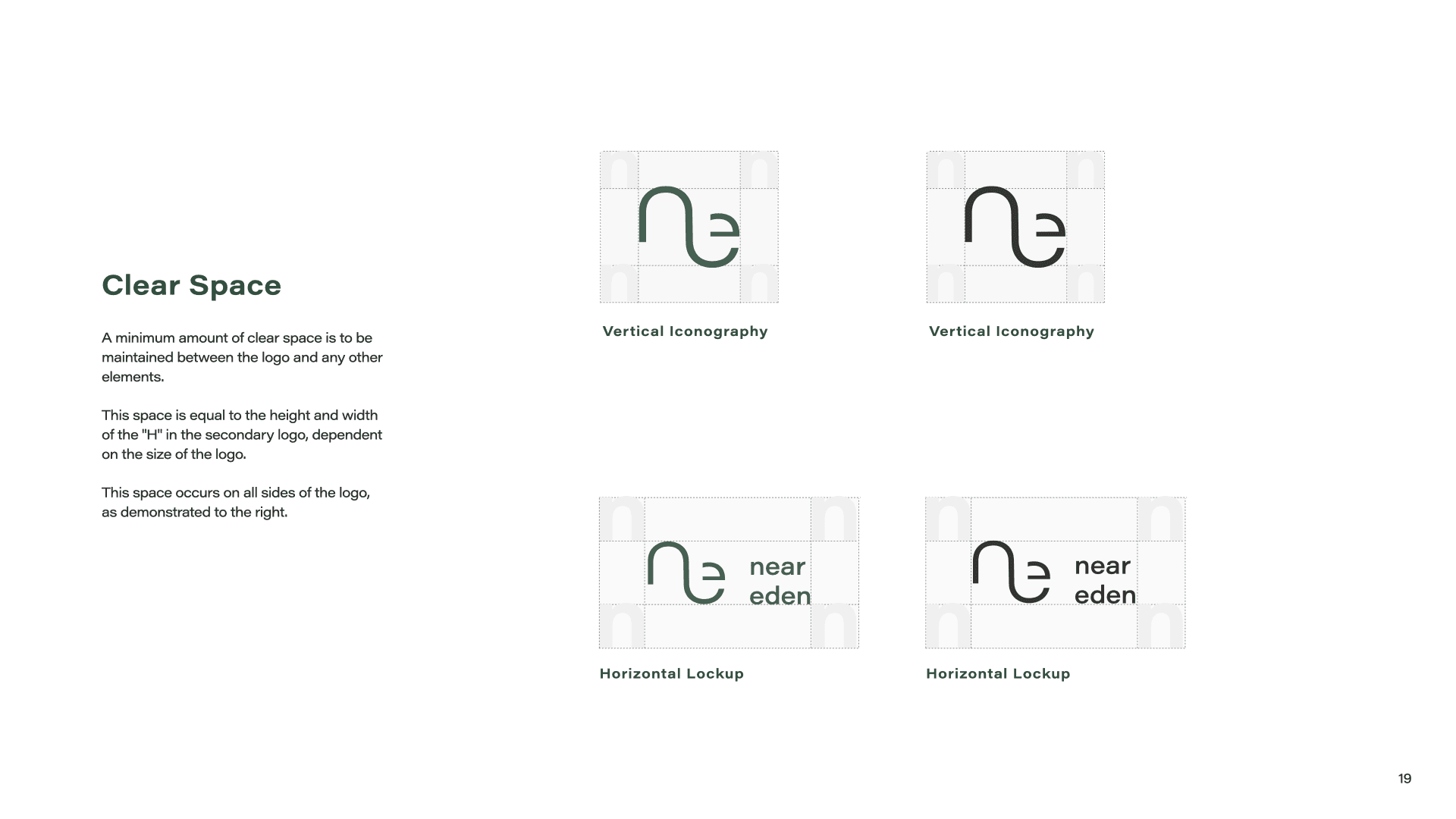
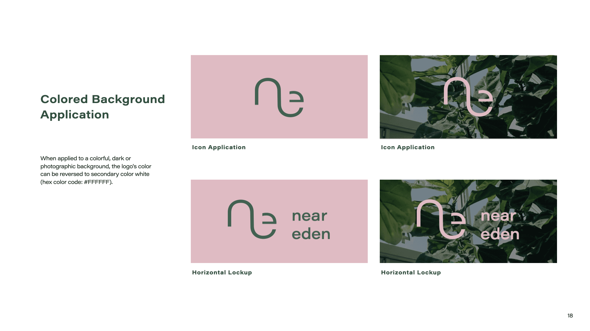
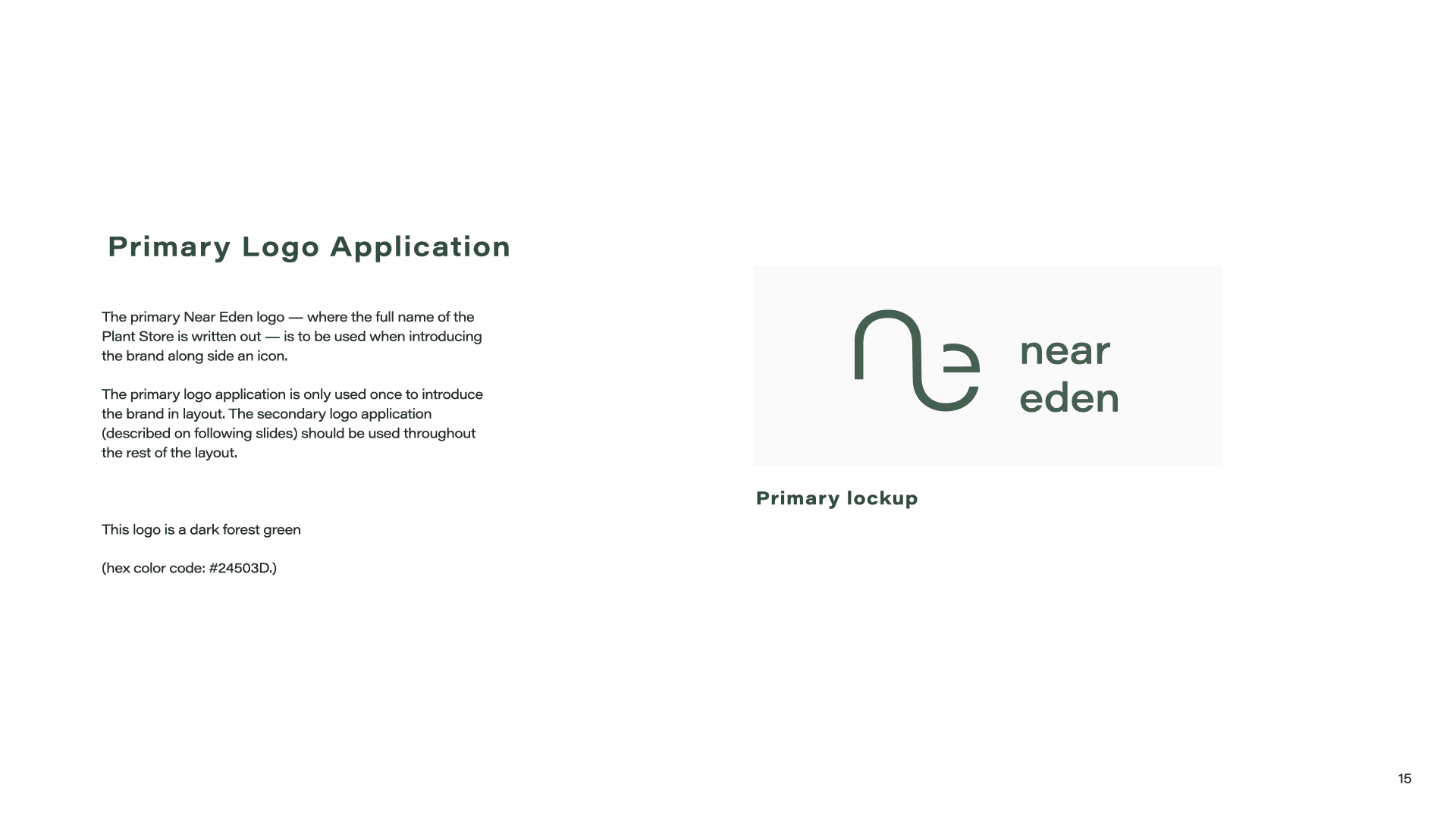
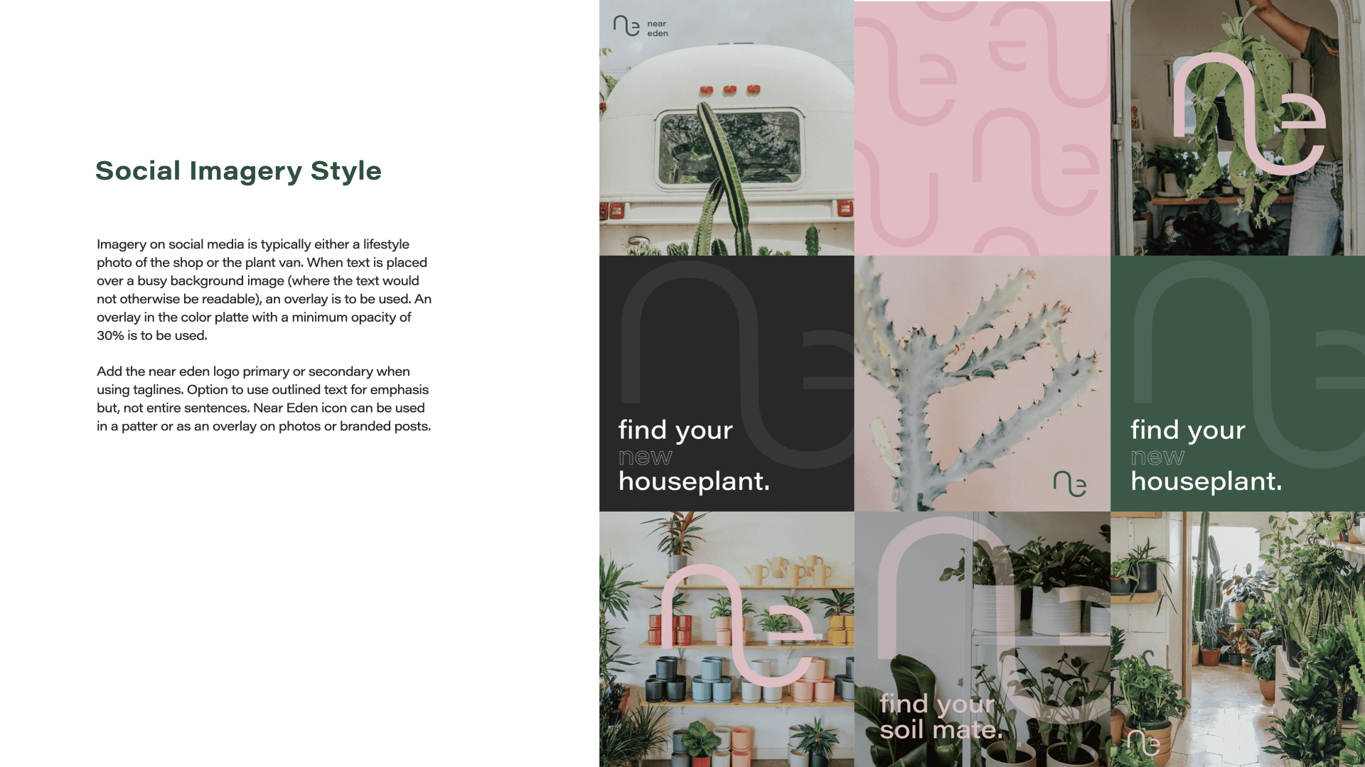
Near Eden is a typographic letter combination that forms a logo and a brand.
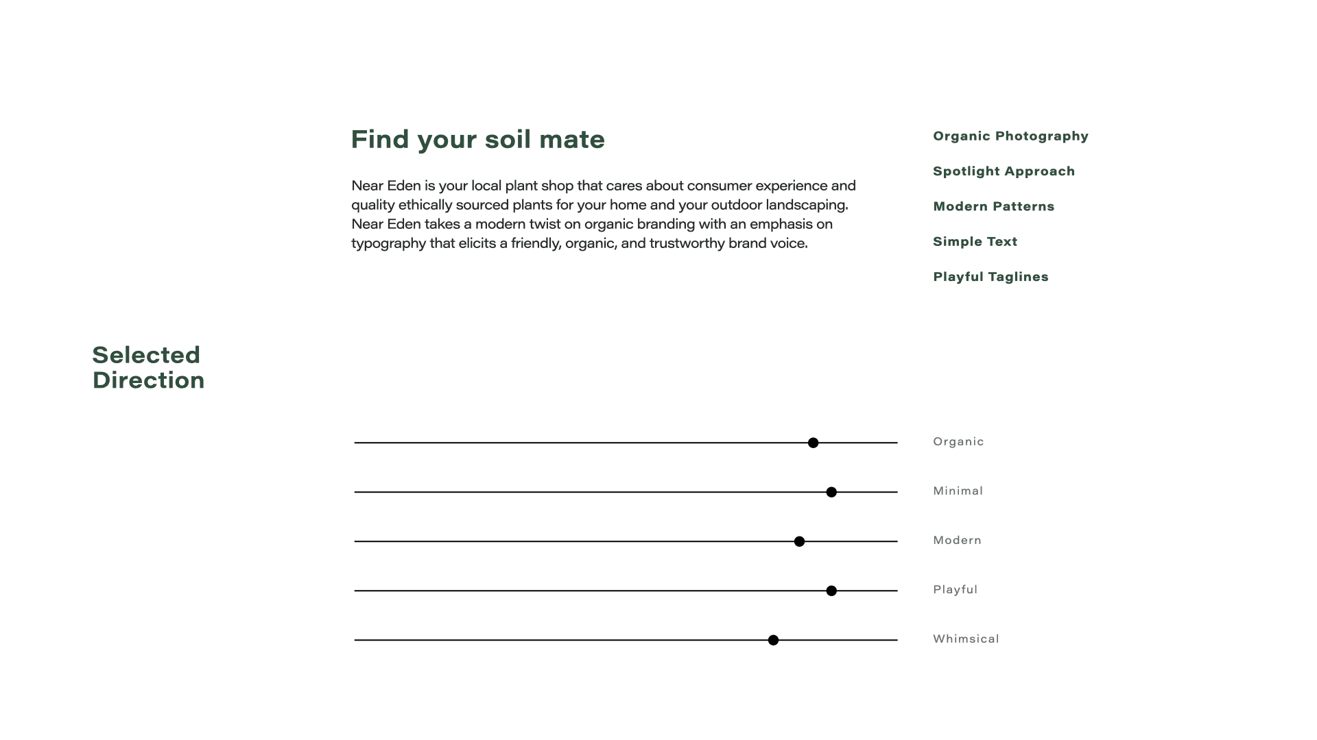
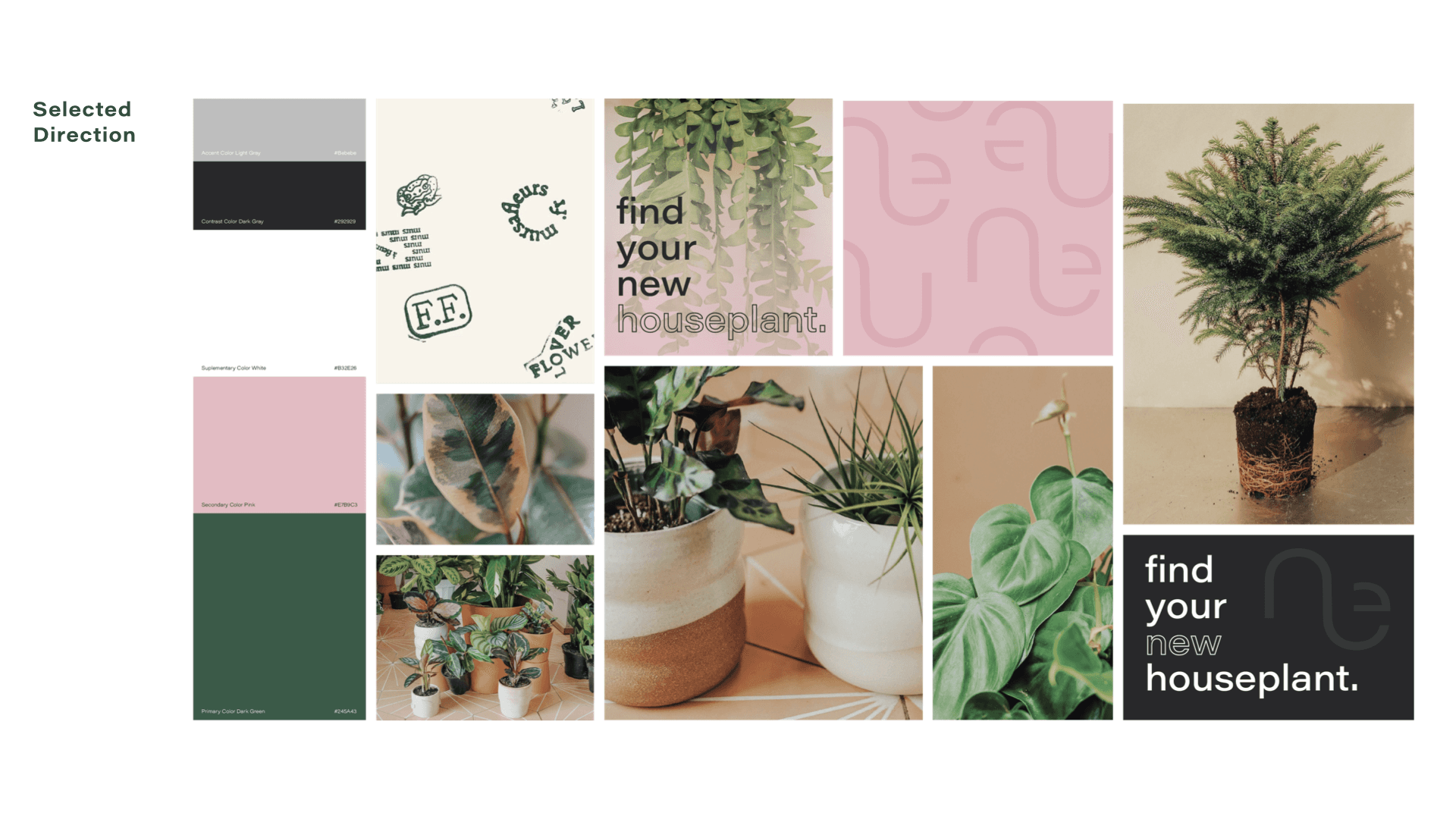
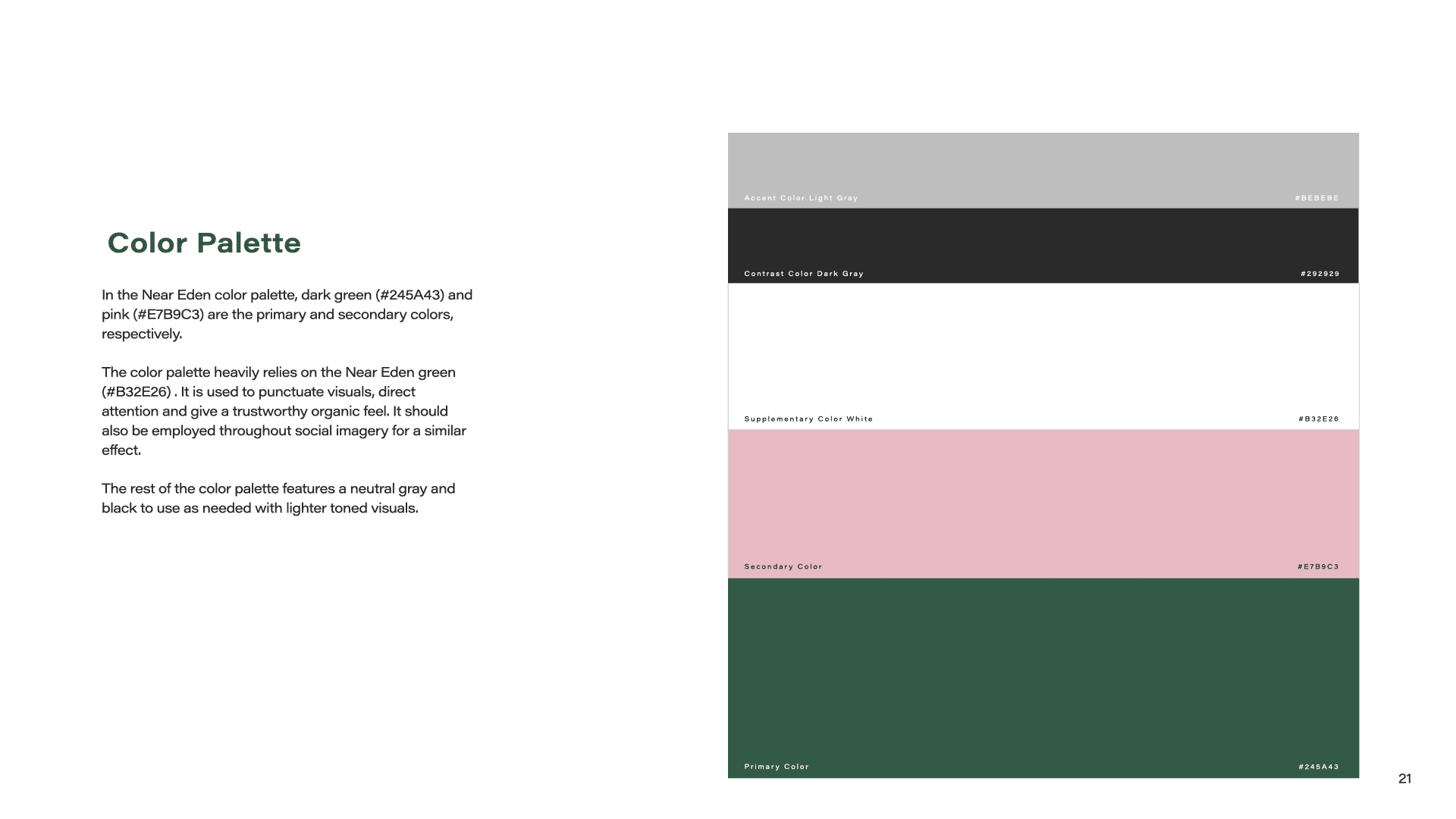
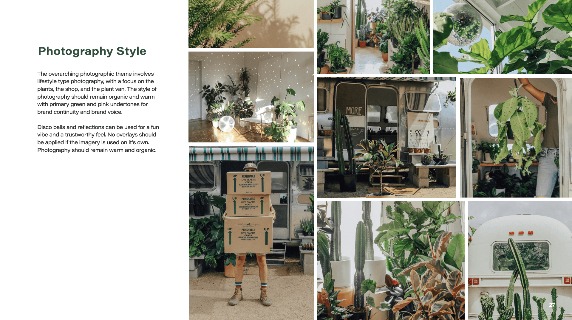
When making design decisions for this brand I wanted to keep with bright and soft colors to compliment the plant shop and communicate a friendly and open environment.
The name Near Eden is a subtle reference to the garden of Eden that is also known though history as ‘Terrestrial Paradise.’
Scope
Branding
Web Design
Social Media
Software
Figma
Adobe Illustrator
Photoshop
The Process
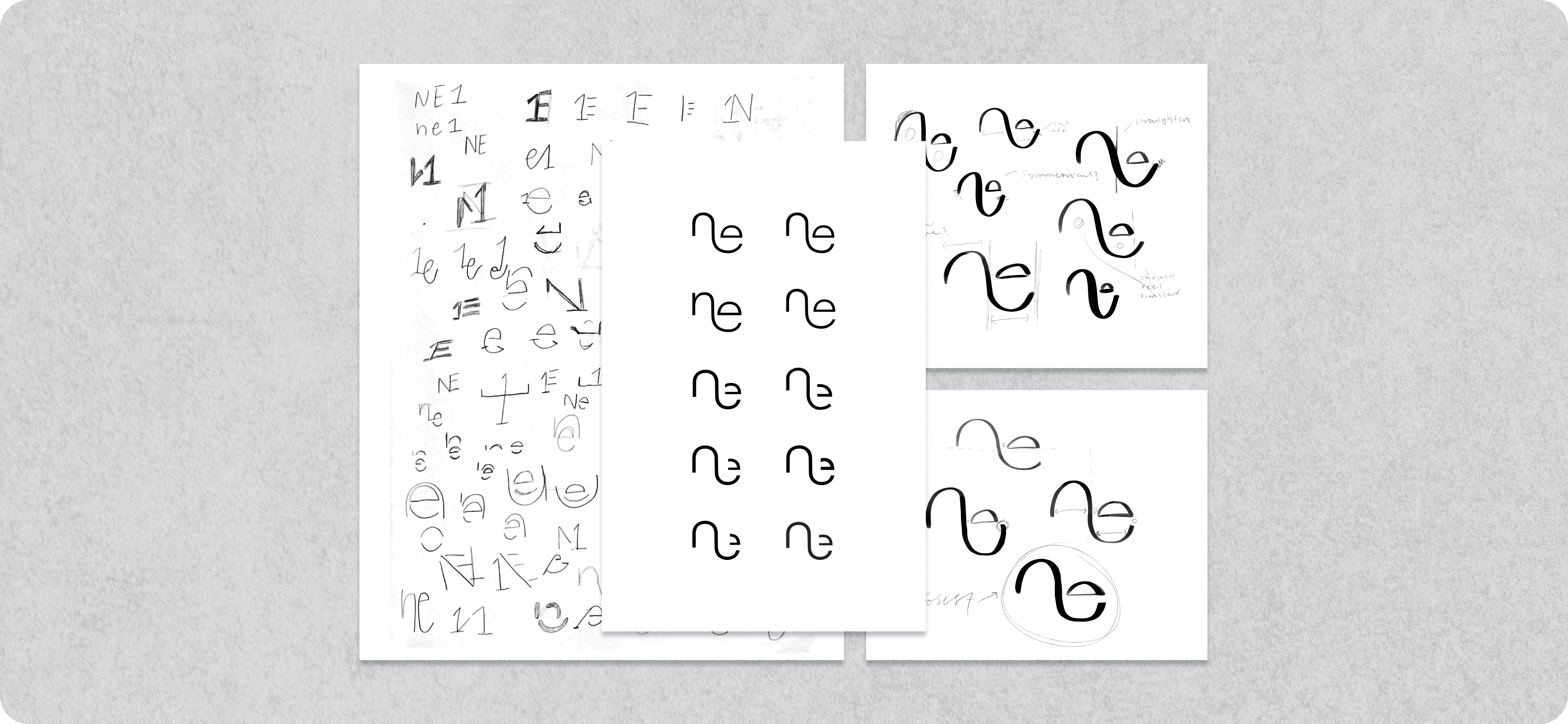
Starting with the sketching process was crucial to my design process and ideation. Starting in a sketchbook gave me the ability to reiterate quickly and build upon more successful ideas before I went to the computer.
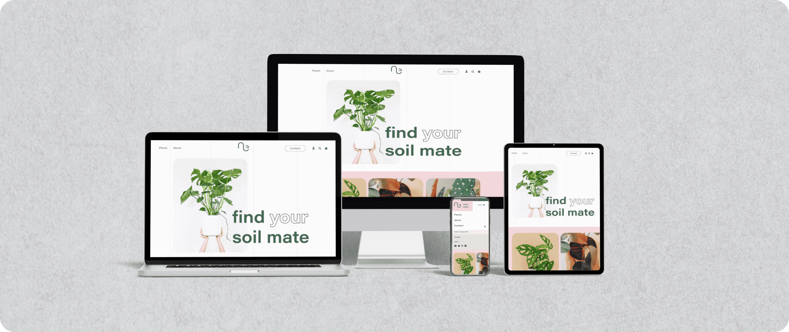
A Responsive Experience
In addition to a brick and mortar building Near Eden plants can be viewed and bought online. The fully responsive site and store gives information about the store, builds the user a profile, and is easy to navigate and understand.
A Brand in Application
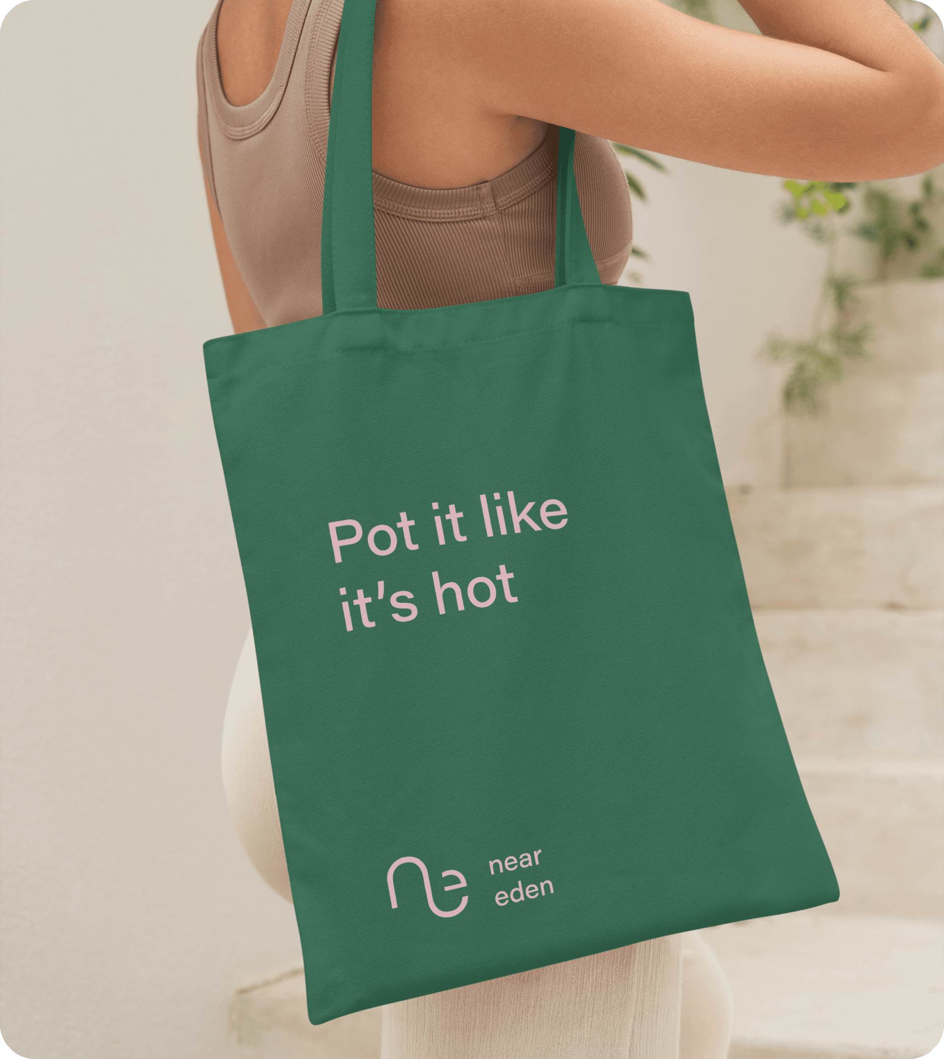
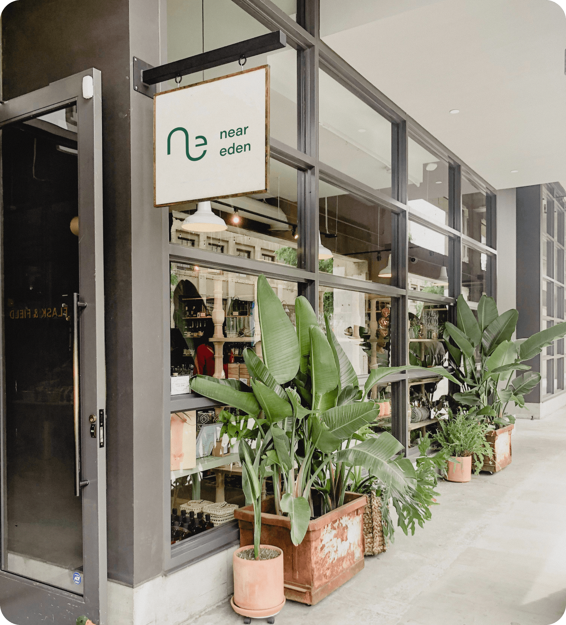
Near Eden has a local store front, a mobile plant airstream for events and travel and various merchandise related to plants. All merchandise follows the brand guidelines and further builds Near Eden as a strong competitor in the plant selling industry.
